You know those creative resumes. The ones with pretty graphics, splashy designs, and beautiful layouts. Often they adapt the design of Facebook or Google and make it into their resume. Journalists lovewriting articles about these "amazingly cool resumes." There are even companies you can buy these resumes from (ick!). But do employers love them? Not so much. Here's the thing with a resume: it's supposed to demonstrate your relevant skills, accomplishments, and experience. And when candidates use a flashy design on their resume, they almost always do so at the expense of actual content -- i.e., their skills, accomplishments, and experience.
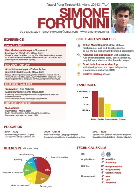
Issue #1: Wasting Space
Let's take a look at one such "creative" resume (which is actually one of the better ones I've seen).
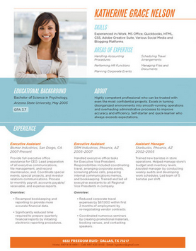
Now, what happens when we take this exact same content and lay it out in a more standard resume format?

Look at all that extra space! Even with much larger margins on the standard resume than on the creative one, we still have about 40% of the page empty, just waiting for us to add more content.
(Thanks to Simone Fortunini for letting me re-post his resume. He's an online marketing manager. Go check him out here.)
Issue #2: Large Blobs of Text
In addition to wasting space and therefore not having enough space for actual content, these creative resumes almost always make a second mistake: they fail to write their accomplishments in nice, short bullets. Many have just massive chunks of text in paragraph form, virtually assuring that people won't read what this person has done. Apparently, blobs of text are easy to format to look pretty.
Creative resumes will win you points on creativity and design, but at the expense of showing other skills and accomplishments. Maybe that's worth it, if you're applying for a graphic design position. (And I do mean "maybe" -- how much do companies want to hire someone who creates beautiful but ineffective designs?)
But any other position? Stick with a boring -- but clean and organized -- template, like this one.